I'll preface this by saying that I have no idea what I'm doing. Also, this is by no means a complete or perfect model. But after many tries I'm at a point where I'm happy with sharing some pictures and an early version for you to try out.
Classic Negative (SD 1.5)
 With Classic Negative I tried to train a model with DreamBooth which closely mimics my style of photography. Its name comes from a built in camera profile in Fujifilm cameras, "Classic Negative". I use a modified version of this profile in basically all of my photos. To mimic my style, the model must achieve the following:
- recreate the color profile of classic negative: muted and desaturated greens
- introduce faded blacks and diffused highlights (like a Tiffen Glimmerglass Filter would do)
- reliably create a nice depth of field effect like you would get with large aperture lenses
- improve the composition of the default model (foreground and background objects, framing, point of view)
- improve the lighting of the default model
- add grain and preferably a slight vignetting
- try to recreate the look and feel of old 35mm film photos
Training
For training I used 100 of my personal images, consisting mainly of environmental portraits and photos of my dog, some macro and some landscape shots. The model is probably biased towards forests and garden pictures, since that's where I took the majority of my photos. It seems to be on the verge of being overfitted, in some generated pictures I could clearly make out the general structure of my backyard. The captions were written manually for all of the photos. Nothing too complicated, here's an example: https://i.imgur.com/prf8VxS.png
I trained for 1800 steps with a learning rate of 1e-5 and 350 text encoder steps using TheLastBen's Fast DreamBooth ipynb.
Prompts & Parameters
The prompts I tried so far are very simple. The activation token is classicnegative
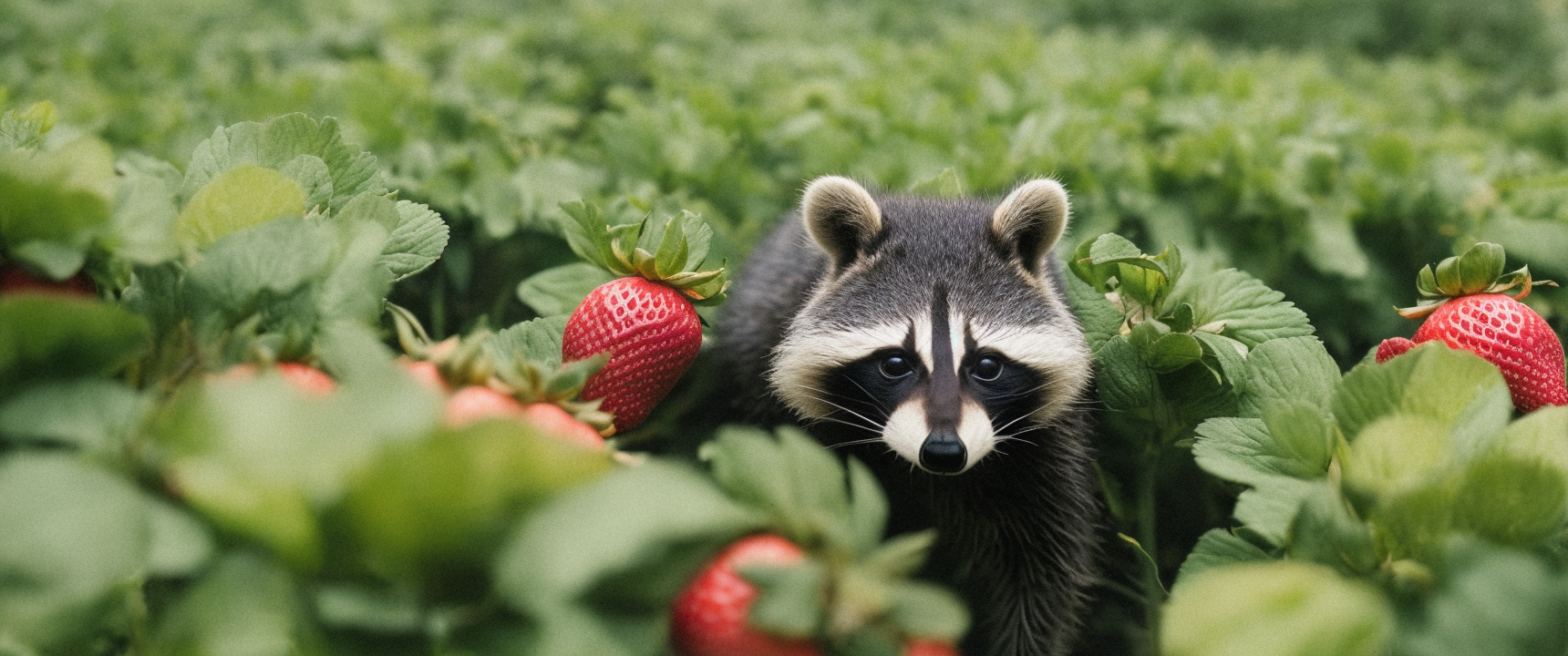
- classicnegative photo of a cute raccoon sitting between bushes in a garden, purple tulip flowers
- classicnegative photo of a cute small red panda sitting on a branch in the jungle
- classicnegative photo of a white fluffy rabbit standing in a garden illuminated by fairy lights, winter, heavy snow, snowflakes
Parameters: Euler A, CFG Scale 7, 30 Steps, 860x360px
I then went seed hunting. Although in a batch of 4 there was at least one usable picture so far. If a good picture was generated, I set the same seed and ran it again with Hires. fix enabled (which takes like 3,5 minutes with my GTX 1070 for one picture).
Hires. fix Parameters: ESRGAN_4x, 30 Steps, 0.3 Denoising, Upscale by 2
I discovered this by accident, but using these settings the picture stays exactly the same and all the film photo characteristics like the grain won't get lost during upscaling. If the effect of the model is too strong, try adding tokens like sharp focus, high contrast, clarity to your prompt. Or just increase the contrast in post. But yes, sometimes it becomes a bit too much, I'll have to take a look into it for a future revision.
What's next
- more testing is needed, different parameters and subjects
- create a SD2.1 768px version
- finetuning
Please feel free to try the model out, test its limitations and if you have any advice on how I can create a better version of it, please let me know ;)